INDUSTRY:
ART
CLIENT:
LEON
YEAR:
2025
EXPERIENCE:
LOGO
LOGO
about.
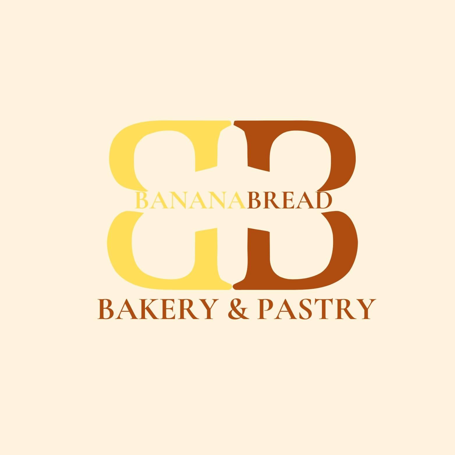
Logo Description – Banana Bread Bakery & Pastry
This logo design features a clean and modern concept that reflects the warmth and comfort of homemade baked goods. The interlocking “B” letters symbolize both “Banana” and “Bread,” forming a balanced and unified design that represents craftsmanship and quality.
The color palette combines soft yellow and warm brown tones, inspired by the natural hues of freshly baked banana bread — golden, rich, and inviting. The elegant serif font conveys sophistication, while maintaining a cozy and welcoming bakery vibe.
Overall, the logo captures the essence of Banana Bread Bakery & Pastry — a brand that values tradition, warmth, and the delightful experience of every bite.
challenge.
Creating this logo was a fun yet challenging process. I wanted to design something simple but meaningful — a mark that instantly connects to the warmth and comfort of fresh banana bread. The biggest challenge was balancing elegance and simplicity while keeping the design visually memorable.
The concept of using two mirrored “B” letters came after several sketches, representing both “Banana” and “Bread” coming together in harmony. Choosing the right shades of yellow and brown was also essential to capture the bakery’s cozy and homemade feel without losing a modern touch.
In the end, this logo reflects not only the brand’s identity but also the creative journey of refining every detail — from color to typography — until it perfectly symbolized Banana Bread Bakery & Pastry.